
Toronto Cupcake Redesign
Toronto Cupcake, a cupcake delivery business in the greater Toronto area, was in need of an updated website. I gathered brand information and put together a revamped responsive homepage design as a proof of concept show the potential of the site. I took took inspiration from small bakery sites as well as larger treat brands.
Analyzing The task
Research and Competitive Analysis
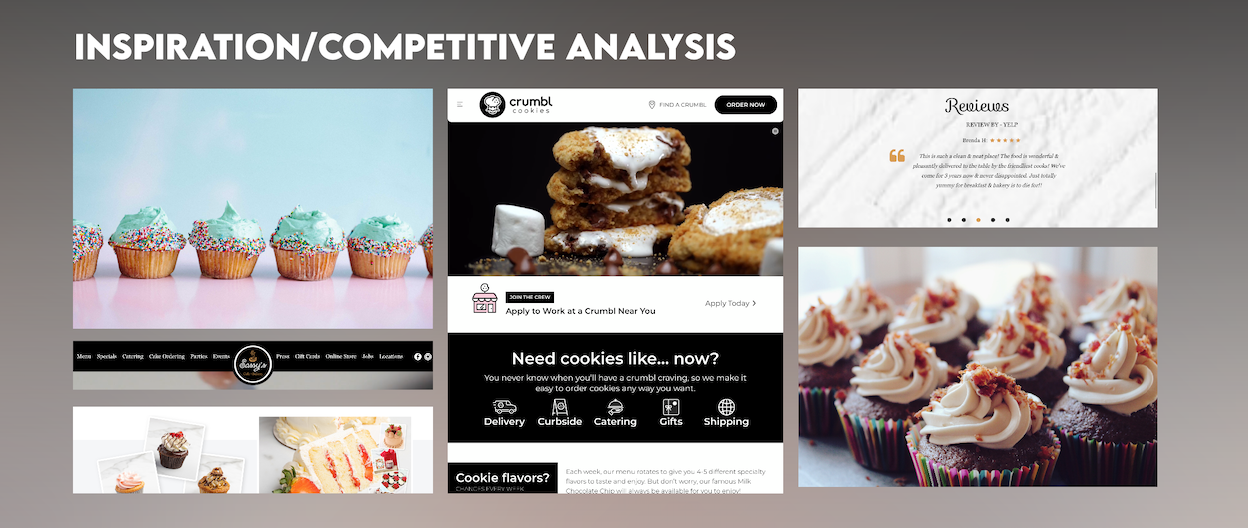
I began this project by reviewing Toronto cupcakes current website and identifying what kind of business it was. After finding out that they are a local cupcake delivery service I begin to conduct competitive analysis, reviewing websites of small bakeries and large treat companies such as Crumbl and Insomnia cookies. I also gathered inspiration images to refer to for visual decisions in the rebrand and mock up stages.
Rebranding
Distribution and Demographics
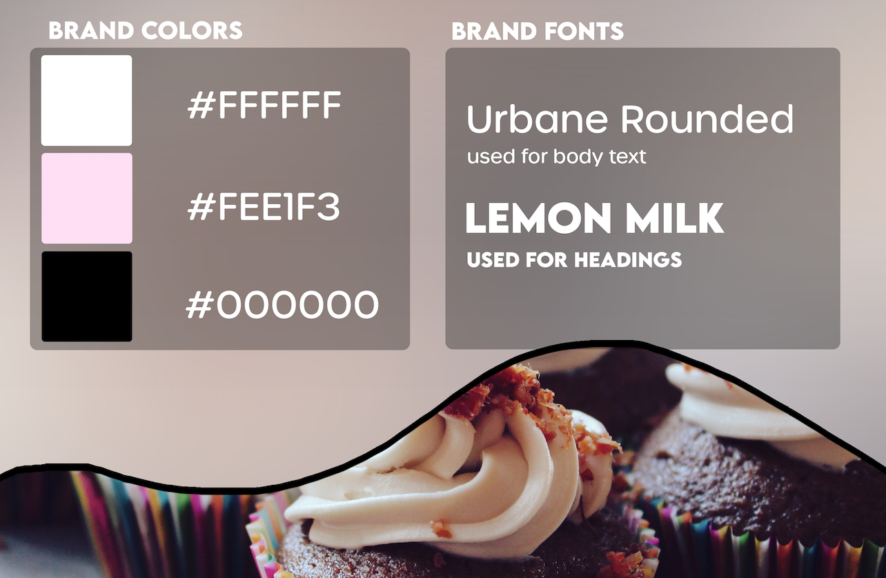
While I kept the shade of pink from the company's existing brand, I reduced the rest of the color pallet to opacities of black and white to create a more simple, premium appearance ( to match their relatively high price point compared to other options in the area). I also moved away from the dreadful choice of Comic Sans to the sharper Lemon Milk font for headings and more classy (but still rounded and readable) Urbane font for body text. I also decided to adopt the icing curve to mask images as a part of their new, sleek rebrand.
Sketches and Mockups
Visual Ideation
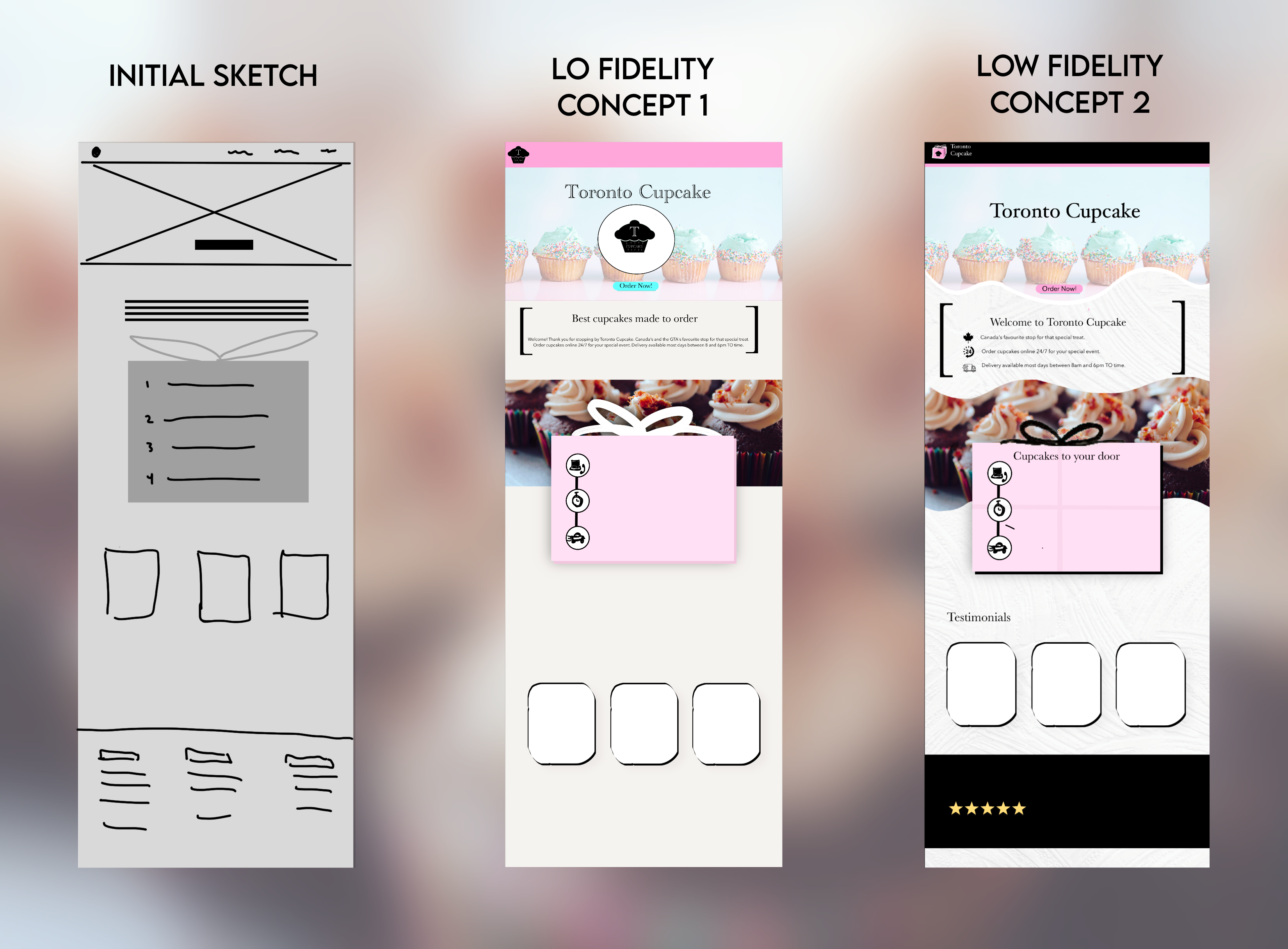
Based on the content on the current Toronto cupcake website and the homepage of other bakery businesses I concluded that the purpose of the homepage should be to give an overview of the business, explain what they offer, and above all make it easy for customers to take advantage of their services. When laying out the site I knew I wanted to implement a large visual hero image with a call to action to provide users with the ability to quickly purchase cupcakes without even scrolling. I would then highlight a few key elements of the company including their location, hours, and primary service. I then wanted to utilize the brand icon of the pink box to frame out the steps necessary for a customer to buy cupcakes from this business. Lastly, I wanted to include specific products to show off the premium quality of Toronto Cupcakes and testimonials from yelp back this.
Final XD Prototype
Coding Qualitiative Data
After iterating the initial sketch multiple times, I landed on an overall layout and color scheme that I was happy with. Using adobe XD I started to create the final prototype. I utilized primarily black objects, with pink accents to act as calls to action, and low opacity white backgrounds for large sections of text. To add visual interest I created a basic illustration of the pink box icon to house the steps in the customer journey and overlaid it on a parallax image. I also used the icing shape to mask out images including the hero and parallax. After adjusting the design to fit a mobile device by stacking elements, reducing section widths, and adding functionality like a horizontal scroll for the product gallery, the final prototype was complete.